
At the very start of the projet we identified our target, secondary and tertiary audience so we knew exactly who we were appealing to.
USES AND GRATIFICATIONS
We heavily referenced Blumler and Katz's Uses and Gratifications Theory when making our video as I've mentioned briefly above.
Particularly with the narrative section we thought it would be good for "Personal identity" as people would be able to see their past relationships and even friendships in the narrative. They might even be envious of the relationship between the two actors. Electronic fans will definitely identify with the desire to dress unique and act cool and so admire or aspire to be like NTLS.
|
|


RESEARCH AND PLANNING
DIGIPAK
DIGIPAK
We also introduced them to the possible idea of having a panoramic album cover and showed them the picture below as an example, then asked for some feedback
 |
| Mock-Up of panoramic album cover idea |
Feedback from a member of our primary audience:
When informally asking various members of our secondary audience about the panorama idea, they thought the same thing as the member of our target audience in the recording, who thought we needed to show the artists faces clearly on the front panel. So, we then made some mock-ups of the front panel with a centrepiece graphic and showed them to members of our target audience in a focus group to see if they liked the idea
When informally asking various members of our secondary audience about the panorama idea, they thought the same thing as the member of our target audience in the recording, who thought we needed to show the artists faces clearly on the front panel. So, we then made some mock-ups of the front panel with a centrepiece graphic and showed them to members of our target audience in a focus group to see if they liked the idea
 |
 |
We received nothing but positive feedback and they also decided they preferred the circular design to the squares.
WEBSITE
After researching some Electronic/Alternative websites, we realised a lot of them based the website around the album cover. So, we drew up a page and developed it onWix to send to our target audience in a Facebook group to receive quick feedback
 |
 |
MUSIC VIDEO
To showcase the performance and narrative ideas we had began to think of, and to give an idea of how the video will look visually, we made an Animatic and Steal-O-Matic. We knew this would be helpful to us when it came to making the music video, but we also realised we could gather feedback on our ideas for the visuals and the structure of the entire video.
We set up mini-screenings of both to gather feedback from our target audience. They loved the Steal-O-Matic and thought the idea for VHS and HD would be a great unique selling point. This feedback really relieved us as we were worried the contrast was too confusing. The first thing a lot of people said was they wanted to see examples of what the archived footage would look like, as opposed to the black screen because it interrupts their suspension of disbelief, so we revised the animatic
Our target audience thought the overall structure was good but we should play with cuts and the music more to avoid it becoming "samey." This was useful advice which we would go on to remember in editing.
CONSTRUCTION
MUSIC VIDEO
CONSTRUCTION
MUSIC VIDEO
Whilst we were making the video, we gathered feedback along the way to ensure we were producing something our target audience would like.
Here is some feedback we gathered on our first cut from our target audience who initially watched the animatic:
Here is some feedback we gathered on our first cut from our target audience who initially watched the animatic:
From the two screenings above and notes we took down as they were reacting to the video, we gathered the following information:
- The VHS and HD footage really compliment each other and give the video a stylistic and edgy feel
- The editing in the studio (with the snappy blinks and the flashes) looks great and futuristic, definitely connotes the genre. We should be mindful of the VHS footage as the cuts don't go with the music and its too noticeable and so creates a disjuncture between the track and the narrative when the narrative is meant to depict the song
- The amount of VHS is too much. During "Sometimes I still need you" and the final section of the song, we should add more of the artists because primarily, thats who the audience are watching the video to see.
We were critiqued quite frequently on the narrative progression surrounding the couples relationship, saying that it was quite weak and didn't have a clear ending. To change this, we rearranged some VHS sequences to create a clear beginning middle and end. We also filmed an extra scene to conclude the video
 |
 |
The final films that we shot after audience feedback
This feedback was really useful, we took it on board and re-edited. Then showed this to other members of our target audience
(Please press play, after the blank the audience reactions resume at 00:41)
(Please press play, after the blank the audience reactions resume at 00:41)
Getting this feedback on the performance and narrative was really great. It informed us that the audience were able to suspend their disbelief when watching the narrative and build up emotional connections with the characters in the story. They also liked the intensity and style of the performance and the unique editing.
DIGIPAK
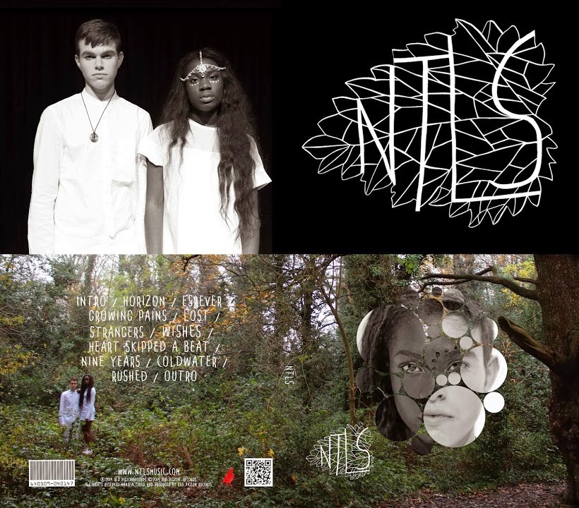
Initially, the internal DigiPak cover was what appears on the left. We informally showed this to members of our target audience and some avid CD collectors and they all pointed out that having LuLu on her own on the right hand side suggested she was more important and it would strengthen the brand image if we perhaps had the logo or maybe a picture of both of them on the right hand side. So, we made this change.
We were also advised by an avid CD collector, that it is typical of Digipaks to contain a QR code which when scanned will take you to the website. We thought this was a great idea and added it in as it also created even greater synergy between the platforms.
WEBSITE
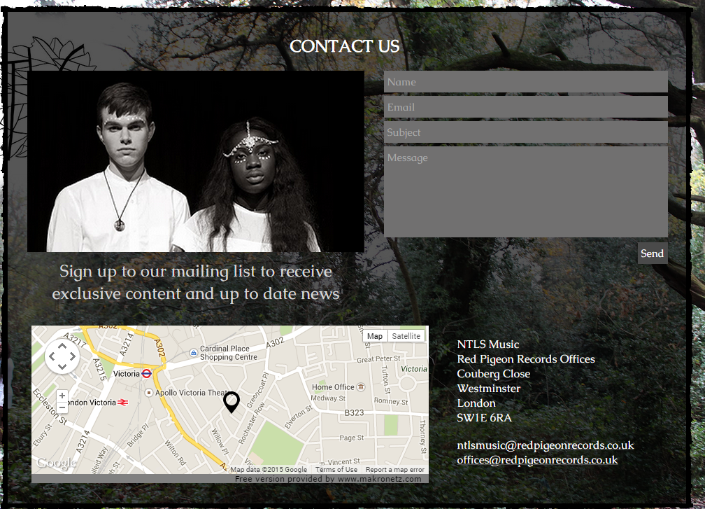
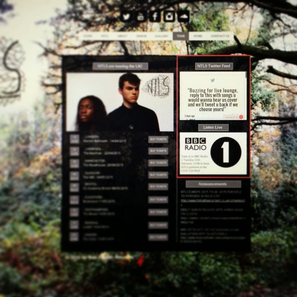
We emailed the link to members of our target audience to flick through our first draft of the website and they returned with mostly positive feedback, just making two points on the tour page and contact page.
A lot of people thought the tour page was quite empty whilst also saying they would like a way to feel connected with the artist and know a little more about that they are doing. So we added a twitter feed and an advert for their BBC Radio 1 performance, which showed symbiosis with companies that our target audience could identify with.

EVALUATION
MUSIC VIDEO
To gather feedback on the final product we used SurveyMonkey to gather some qualitative and quantitative audience feedback, posting it on our social media pages to prompt people to watch the video and respond - this was a great way of gathering feedback because it was anonymous so people were brutally honest.
DIGIPAK
|
|


We were also advised by an avid CD collector, that it is typical of Digipaks to contain a QR code which when scanned will take you to the website. We thought this was a great idea and added it in as it also created even greater synergy between the platforms.
|
|


WEBSITE
We emailed the link to members of our target audience to flick through our first draft of the website and they returned with mostly positive feedback, just making two points on the tour page and contact page.
A lot of people thought the tour page was quite empty whilst also saying they would like a way to feel connected with the artist and know a little more about that they are doing. So we added a twitter feed and an advert for their BBC Radio 1 performance, which showed symbiosis with companies that our target audience could identify with.
EVALUATION
MUSIC VIDEO
 |
| A post Josh made which we shared onto our social media pages |
|
|


We thought it would also be useful to gather feedback which wasn't just multiple choice in order to have some information wholly based off their opinion. For these questions the person would write in a text box and submit their answer and we had a very large range of replies.

From responses like "relationships can break down because people change as inidivudals..." and "the fragility of teenage relationships" we were able to conclude that the audience understood the narrative and the overarching theme of a declining relationship.
The answers for whether the video and presentation was professional/believable and if there was anything we would change ranged in length and we also received some really constructive criticism as shown above.
PERFORMANCE
In all circumstances the artists ad their image was believeable, however one respondent made a good point of if the artists looked older, it could have worked better. This was definitely something I agreed with when working to the strengths of the group for the efficiency of the project, it wasn't something we were able to do so I still feel we made the best of the situation.
NARRATIVE
The narrative got some great feedback. Respondents loved the contrast between HD and VHS and really built up an attachment with the couple. However some thought the VHS was too static and disliked the lack of quality. Although, when I looked at the answers of the respondent who didn't like the VHS, it seems they aren't a fan of the Electronic/Alternative genre which explains why less conventional filming and editing styles aren't as welcomed by them.
In all circumstances the artists ad their image was believeable, however one respondent made a good point of if the artists looked older, it could have worked better. This was definitely something I agreed with when working to the strengths of the group for the efficiency of the project, it wasn't something we were able to do so I still feel we made the best of the situation.
NARRATIVE
The narrative got some great feedback. Respondents loved the contrast between HD and VHS and really built up an attachment with the couple. However some thought the VHS was too static and disliked the lack of quality. Although, when I looked at the answers of the respondent who didn't like the VHS, it seems they aren't a fan of the Electronic/Alternative genre which explains why less conventional filming and editing styles aren't as welcomed by them.
 |
| Respondent who commented on video quality |
On a whole, I feel the music video gratified the audience. I feel as though they were able to identify with aspects of the relationship and hence why there were quite a lot of passionate responses to "what is the message behind the video." From the feedback it seems they loved the duo and thought they were really cool. From a stylistic perspective, using the actual VHS camera was a great choice but there is a lot of quality lost in certain shots which could have been avoided by just using a HD camera and editing carefully in post-production.
DIGIPAK
We held a mixed focus group with members of our primary, secondary and tertiary audience to gather some feedback on the Digipak. We had an overwhelmingly good response, below is an individual response from a member of each audience group:
We gathered from these interviews and the focus group overall that we had created a strong digipak which was synergistic with the other two texts. If we were to make any improvements and alterations, we could perhaps consider placing some lyrics from songs onto the cover.
WEBSITE
After we showed the focus group our album cover, we showed them the website. here are some individual responses from different members of each audience group:
Overall, the feedback was really good. It seems having the "About" page was great as it brought the artist down to a relateable level which allowed the audience members to connect with them. They loved the style of the site and it's synergy with the other texts, The interactivity was also a plus as it meant the site was engaging. If any improvements were to be made, we could think into some more merchandise such as the merged face graphic on a bag or a t-shirt.
From gathering feedback throughout the project, I've really learnt the importance of it. Without referring back to the needs of the audience we would have made what we "thought" they were going to like as oppose to what they actually wanted to see. I think because of our constant feedback, we made three great texts which were spot on for our target audience and were also able to really appeal to members outside our target audience.