
Hello and Welcome to my A-Level Media Blog. My Name is Vivian Oparah [0621]. On this project, I have been in Group 5 and worked with Louis Caldwell [0131], Sebastian Hodge [0330] and Joshua Brooks [0110]. To navigate around my blog, you can click any of the headings under the 'Labels' subtitle on the side of the page - this will filter posts into the various stages of the project.
At the bottom of the page, there is a link which takes you to 'Older Posts' which can be clicked on as well.
Thank you for reading and I hope you enjoy my blog!

"NTLS - Heart Skipped A Beat" Music Video


Our Music Video

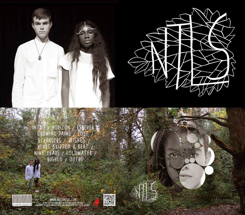
NTLS Self-Titled Digipak Cover

NTLS Self-Titled Digipak Cover

NTLS Website

NTLS Website
Right-click the image and select "Open link in new tab" as this will take you to the official NTLS site
Showing posts with label DYM Homework. Show all posts

Saturday, 12 October 2013

Dexter Title Sequence Re-Edit Evaluation

1) Summarise the conventions of the title sequence that were most important to this task.

In terms of conventions, there were some key points that we moulded our ideas around such as: 
  • A diverse title placement to avoid it looking boring and repetitive,
  • Making the programme name stand out from the names of the actors, producers and directors 
  • Picking fonts, font colours and animations that were suitable and relevant to the show
  • Maintaining these style aspects throughout
From previous knowledge, we were aware that all directors, actors and producers usually had a legal right to be mentioned in the opening title sequence, therefore including them was compulsory 


2) How did your group plan to edit the title sequence (consider timings, industry requirements etc)?

Aidan and I thought the titles would grab the attention of the audience if they were placed/moved around with regards to what was happening in the background. This meant a lot of time was spent perfecting timing and movement - for the ones we completed, it worked very well, but it meant a lot of shots were left with no titles.
We intended to include all the names of actors, producers and directors in the appropriate places on each shot, using typography relevant to the genre of Dexter.

3) Explain the creative decisions made by your group.

As Dexter is a Crime Thriller and a the main character is a serial killer, we found it would be fitting to have our font colour as a deep red as this colour has connotations of danger, pain and bloodshed. The font was very easy to read so the audience would be able to focus on the background and the title, we also dropped titles in places where there was a high contrast between the background colour and the text colour to make it easier to read . When we included animations, they worked in tune with the background for example a rotating title over a moving coffee-maker, this made the background and title work as an ensemble to be more enticing. 

4) How did your re-edit compare with the original?

Our font and font colours were very similar to the original, as well as our title placement because we were able to tease out some of the gaps that had purposely been left in background and place our titles there. However, the original had a lot more titles running over more than one shot which allowed the audience more time to process the title and what was happening in the background, whereas we had a title to a shot so it would have been a bit more difficult for our audience to focus even though we had a lot fewer titles. Timing was an factor that prevented us from adding more titles, although I would not as put in as many titles as they did as it started to look very overcrowded.

Wednesday, 2 October 2013

Art of the Title Evaluation


  1. Summarise your film idea
    Our film 'Clarence' is about a serial killer who was driven to insanity by the murder of his own daughter when she was young. Therefore now, in some twisted sort of revenge, poses as a caretaker in a school where he targets and kidnaps teenage girls and treats them like babies.
  2. What kind of information has been included in your film opening?
    The film opening actually gives a large insight into the main story behind the film. Shot 1 reveals that he has handpicked targets which stem from an obsession with young girls and Shot 2 shows he has quite a systematic way of selecting his victims. Shot 3 shows a teenage version of the girl in the shot before applying makeup quite innocently, although this shot has a lot brighter lighting that the two previous shots, there is a big sense of foreboding as we know she has been selected, this ominous feeling is carried on into Shot 4 and intensified as the audience can see what is going to happen to her before she does. Shot 5 is taken from a high angle showing a character who we can now assume is 'Clarence' dragging the body of the girl from the previous shots into some sort of dungeon which reveals it is part of a school as it is close enough to drag her, otherwise he would've had to transport her by other means. Shot 6 is quite eerie as its very dark lighting and only has children's toys in the frame, this shot underlines his obsession with children after the passing of his late daughter. Shot 7 links back to Shot 1 showing the 2 girls that he has targeted sitting with distressed facial expressions and dressed as kids but you can't tell any other sinister things he may have in store for them. The only clue we get is from the extreme close-up in Shot 8 where the eyes of the girl are still open and glazed over looking very scared so we know she is alive and the torture isn't over.
  3. How do titles link to the main film idea?
    The titles are in chiller font which looks quite chilling and with the red colour looks like dripping blood which is quite terrifying, this all forms a strong link to the horror genre we placed our film in.
  4. Summarise the expected audience reaction.
    Our aim was that after watching the primary sequence, the audience would feel that 'Clarence' is a very twisted, scary film. It would also create suspense about what happens next as it may appear that a lot of interesting details have already been given away so it poses the question in the audiences mind 'how bad can it get?' In addition, the audience should hopefully be intrigued as to what the character behind the mask looks like and who he is when he isn't wearing the mask.
  5. Identify three things in your grid that are important in the construction of an opening sequence and explain their role in understanding the film
    1) Making the genre clear from the very beginning so the audience immediately know what type of film they are watching. We achieved this with the characters  setting, lighting and titles.
    2) Showing a variety of differently lit at different angles help maintain the audience's attention, we used high angle shots, over the shoulder shots, close ups and extreme closeups in our sequence in dark and well lit areas. Although its a horror, having bright lights before dark lighting forms a contrast which strengthens the usage of the dark light .
    3) Having the title at the end is important as it shows everything leading up to it and it makes it very bold and also tells the audience the name of the film.
  6. How effective is your project as a film opening?
    In my opinion our film opening is very effective. It shows the audience what they are yet to see in the film whilst at the same time creating questions in their mind such as; who is Clarence, how does he have their pictures, why is he doing this and what else can he do? These questions will prompt the viewer to continue watching which is the main aim. It also starts to build up relationships with charectars, for example we feel empathy towards the girl in Shot 4 as she is walking straight into her demise but we are then given hope when we see she is alive in Shot 8, this also makes us want to continue watching to see what happens to her next.
    As an improvement we could have put the shots in non chronological order to allow the audience to make sense of it themselves, it would've also given less away.


Saturday, 21 September 2013

Opening Sequence Analysis


  • This opening sequence begins with non-digetic narration which we assume is coming from one of the two men walking towards the camera in the VLS. We know that this is set in a prison as the mise-en-scene is very dull and mainly grey/navy colours. Also the outfits are plain and uniform but immediately the narrator says "There must be a con like me in every prison in America" so that also tells us we are watching a Crime/Drama film set in a jail.
  • From listening to the accent of the narrator, we know that its taking place in America and he later says "When Andy Dufresne came to me in 1949 and asked me to smuggle..." we know its set around the mid 1900's.
  • We are introduced to the two protagonists in the beginning of the sequence. Firstly, the old african-american man who's voice is being used as the narration. We assumes its his voice because the first close up is on his face and the voice matches his appearance. We know that he is a main character in the film as from the narration we can hear he does a lot in the prison for his fellow prisoners, from this we can infer that hes very respected and known. Also, the camera focuses on him a lot, for example, when they are going to see who the new prisoner is around 1:30, the camera tracks particularly him running to find a spot to watch as oppose to all the people that come after, telling us that he is of some importance. We only briefly see the second protagonist in the prisoner car. The audience know he is the one being narrated as the camera slowly zooms into his face from a mid-shot into a medium close-up. The audience can also tell because the narrator describes him as the "vice president of a large portland bank" and he is the only one smartly dressed in the bus and therefore looks like he'd be the one previously from an affluent background.
  • This first sequence of the film is needed to introduce the two protagonists and tell us they have a relationship before we see them meet. With the aerial shot of the prison we can gauge the vast amount of people there are there. The composed body language of the new prisoners, especially Andy Dufresense, in contrast to the prisoners inside who are banging on the gates almost like animals could show there will be friction between the two groups as they are so different.
  • The dramatic music that accompanies the aerial shot is quite typical of its genre. The instruments used also make it sound more dramatic and mournful - this could be an indication that people entering the prison are loosing their lives and their freedom, it almost makes the audience sympathies with them.