I don't really pay much attention to album covers, but I know that if I saw the following they would be instantly recognisable and so when me and my group make our album cover I hope it has the same effect.
Arist: Cocorosie
Album: God Has A Voice She Speaks Through Me
I really like the album cover because it fully reflects the songs on the album. A lot of them appear light-hearted and magical (unicorns) on the surface but they have quite political and serious undertones (the women in the burqas). I feel the layering of all the images has been done very intelligently and if you focus enough you can almost pick out every individual picture.
The idea of layering imagery is one which know I find quite intriguing and will be interested to play with when it comes to our album covers.
Artist: Kanye West
Album: My Beautiful Dark Twisted Fantasy
There are many different amazing covers for this album but I particularly liked this one. I like the forging of the classicist and cubist art movements and I think it works well with the meaning of the image. Kanyes head with a knife could show although he might an amazing rapper (which is shown throughout the grammy winning album) people still want him dead. It directly relates to some of his song lyrics like in the song Power there is a lyric stating "You've got the power to let power go" so maybe by decapitating himself before people forcefully do it, is shown through this image. Still, I love how thought-provoking this album cover (and all the other album covers for MBDTF) is. I am inspired by his ability to spark up such a conversation simply by his album artwork and not even any of his songs, and would therefore love to emulate it.
Artist: XXYYXX
Album: XXYYXX
This is a really simple album cover but I still think its really cool. Immediately the Eye of Providence is recognisable and with the name of the artist/album beneath it its hard to remove the image from your head. The tear coming from the eye makes it look like an Egyptian hieroglyph which usually had very great meanings. Here, the english alphabet paired with a hieroglyph gives the artwork quite a circular feel of past and present and the minimalism with the colour and the whole thing is quite futuristic.
This could show XXYYXX music (or music in general) is eternal. Again, I really like a simple thought-provoking album cover.
Artist: The XX
Album: Coexist
I really like the simplicity of this album cover, it relates to the artist and their previous album and reflects the music in the fact its quite minimalist and simple but still really nice. The songs in coexist discuss themes of loneliness, intimacy and heartbreak; all experiences which conjure up a variety of emotions and I feel like the iridescent colouring within the X is a symbol of this.
This album cover influences me because it reminds me that less can always be more.
From looking at these album covers I know that when we come to design our album cover I want it to have a message and a strong aesthetic.
Hi, I'm Vivian. I study Media, English Literature, Product Design and Biology at Latymer, and this is my media blog.
At the bottom of the page, there is a link which takes you to 'Older Posts' which can be clicked on as well.
Thank you for reading and I hope you enjoy my blog!
"NTLS - Heart Skipped A Beat" Music Video
Our Music Video
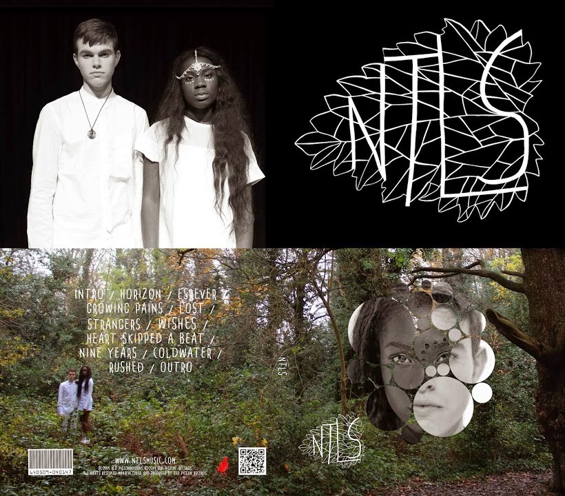
NTLS Self-Titled Digipak Cover

NTLS Self-Titled Digipak Cover


No comments:
Post a Comment